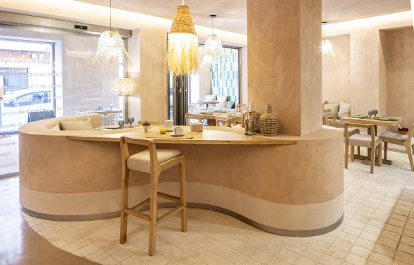
Physis Clinic: glazed tiles on the wall of a cafeteria
Estudio Barea signs the spectacular remodeling of the Physis Clinic in Valencia.
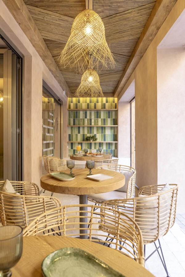
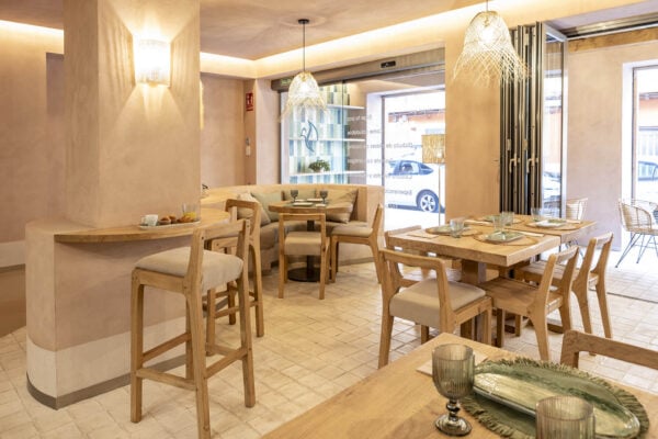
The Barea studio has turned the cafeteria of the Physis Clinic in Valencia into an extremely cozy place. Through the use of noble materials and our glazed tiles on the wall, an extremely affable atmosphere is created. Details such as the rounded wood, the color contrast with the white tiles on the floor, or the arrangement of the furniture, this cafeteria associated with a wellness clinic becomes a unique space, one you never want to leave.
The Physis Clinic is a multidisciplinary wellness space where health is approached from a holistic point of view. For the reform of their business, they have counted on the Barea studio. The Barea studio, in turn, has embebed the functionality in the design of the space. The vibe that emanates from the visible face of the clinic, which is the cafeteria, is one of welcoming, warmth and security. In addition, there is a very clear aesthetic accompaniment to the name of the business itself, which means “nature” in classical Greek.
A very original use for glazed tiles and classic formats.
We are great admirers of the use that has been given in this project to our pieces. To cover most of the floor, Cuadrado 15 has been used with the antique white shade . This format is a safe bet, as we have seen in other projects. In this one, we have added the happy idea of playing with the irregular delineation of the floor, which abuts a smooth and dark building material.
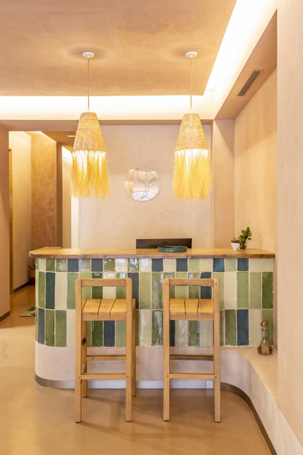
In addition, our glazed tiles have been used on the wall, in greenish tones, to add color. This is a very clever use of our tiles, because in addition to breaking with the beige pact of the rest of the space, they totally give the impression of being plants. The variety of green tones, as well as the strategic placement in highly visible places (such as the wall of the bar, the border of the hallway or the walls of the terrace), bring cohesion and depth to the space.
In another brilliant exercise in originality, the studio has used the same Cuadrado 15 pieces to frame the mirror. The result is singular yet discreet and tremendously elegant. We love it when a project finds new and exciting possibilities for our products. Our sincere congratulations.
More terracotta projects to inspire you
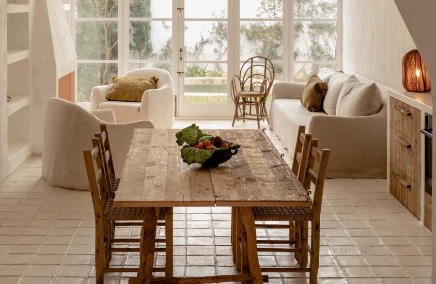
Cales Fonts: all to the white in a Menorcan house full of magic
In the wild fantasy that is this house, we got the pavement. An all white, lovingly handmade fired clay floor that’s a dream come…
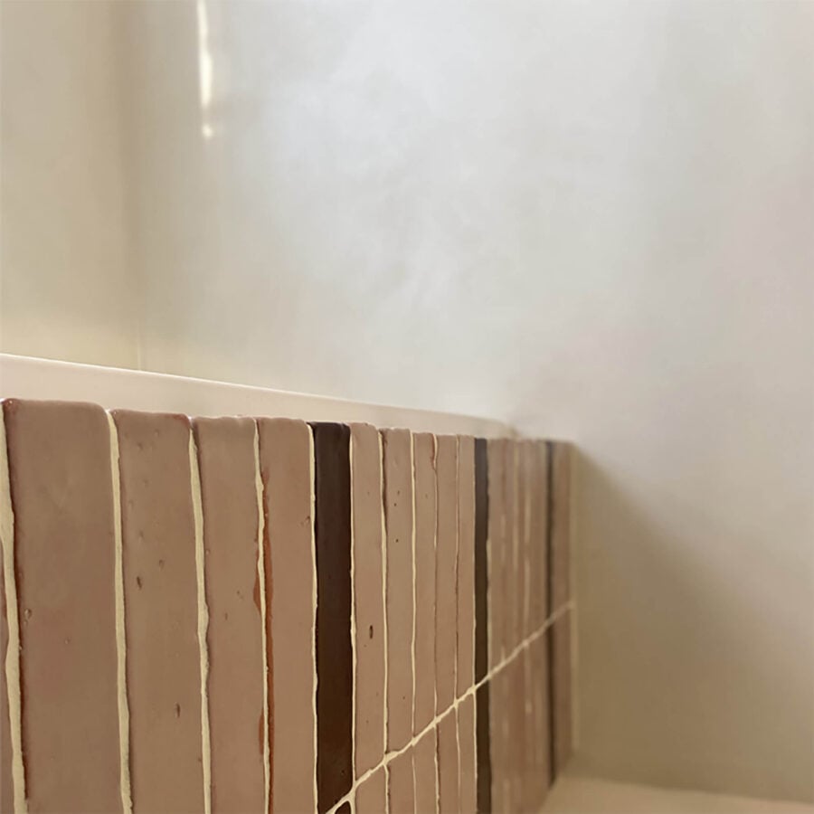
Glazed clay tiles for a family bathroom
Two of our combined formats reinforce the space divide and bring character to this family bathroom Turning the bathroom into a space one can…
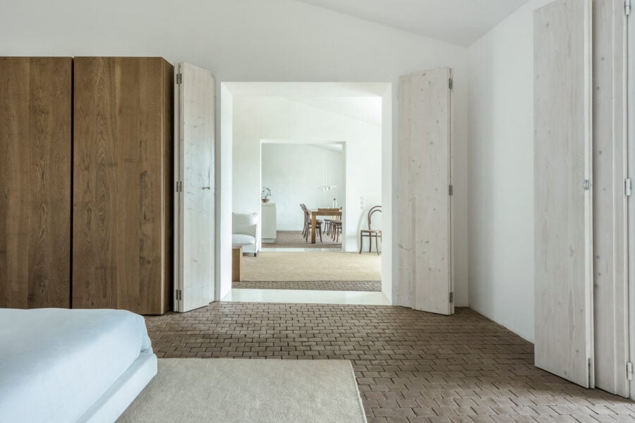
Casa No Tempo: sustainable materials East of Lisbon
The best projects are almost always the product of a joint effort, and Casa No Tempo is a great example. The renowned Portuguese architecture…


