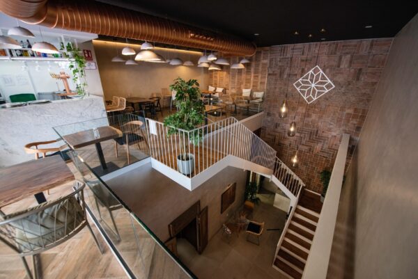
An imposing terracotta wall design for La Sartén de la Abuela
Llenamos una pared de barro con formatos variados de nuestras baldosas de barro artesanales en el restaurante La Sartén de la Abuela
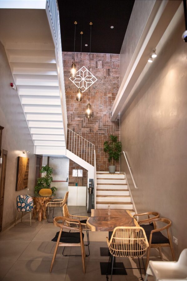
The Plaza Mayor shopping center in Málaga is a popular spot among both locals and the many tourists welcomed by the city year round. Among its many shops, cinema screens and restaurants lies La Sartén de la Abuela, a popular spot where patrons can enjoy the best of Mediterranean gastronomy in a modern and contemporary atmosphere spread across two floors. It was also one of the most enjoyable projects we ever undertook when we covered made a terracotta wall design for this restaurant, making for an unmissable backdrop as you climb the stairs.
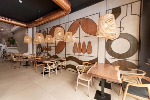
The job was undertaken by Capella Estudio, who chose to use our artisanal terracotta tiles in different formats and sizes to adorn this hulking and impressive wall. They used our tiles to cover even the highest reaches of the wall, to extraordinary and spectacular results.
Traditional fare in a contemporary setting
La Sartén de la Abuela is currently one of the most interesting options to be found on the gastronomy scene in Málaga. Its sumptuous menu offers a rich variety of traditional dishes, all presented in an innovative style that draws our minds to haute cuisine. From grilled octopus to lamb with potatoes or fried calamari, all of the dishes are made in a traditional homecooked style, just like Spanish grandmothers have been making them for year and years.
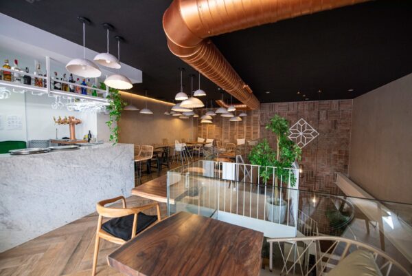
This contrast between traditional Mediterranean dishes and their painstaking presentation finds the perfect setting in the restaurant’s elegant and minimalist decor. Every last detail of this interior design project colludes to make this space into one of those places where you just want to sit back and soak up the atmosphere at a leisurely pace. Behind the concept lies Carlos Capella, who succeeds in showcasing and highlighting the dishes served through his careful curation of decorative elements.
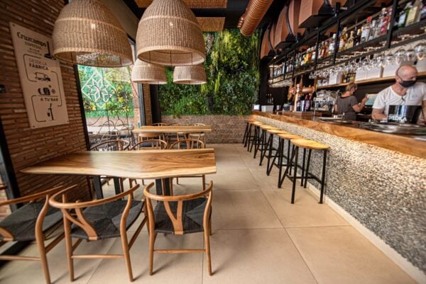
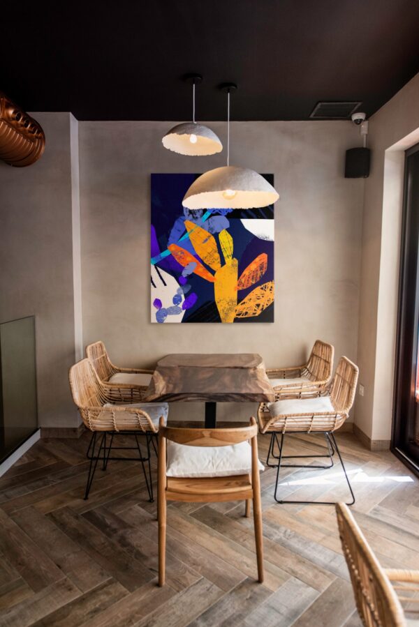
The restaurant stands out for its predominance of neutral tones such as beige and gray in contrast with black. The space is supported by a large picture window which takes maximum advantage of the external light. Characterizing the space are asymmetric tables, chairs and a wooden bar—an interior style based around geometric shapes and organic details such as grass-colored fibers which adorn the lamps and ceiling lights, enhancing the eye-catching greens of the indoor plants which form an admirable vertical garden inside the room.
A terracotta wall design for a restaurant with soul
Among these elements, bringing a natural touch to the space, we find terracotta in a leading role. To cover the high wall in our artisanal tiles, Carlos Capella opted for different formats in our pizarra (slate) tonality. The formats used include: our Cuadrado 10 and 20, our Rectángulo 20×10, 30×10, 40×10, 30×20 and 40×20, and our Triángulo 20. The pieces have been laid out using broad strips of each format, creating a sort of collage teeming with interesting nuances and shades.
What’s more, our tiles also feature on the wall, where the vertical garden is found, and on one part of the floor, once more in our pizarra (slate) tone. Triangles for the wall and large-format rectangles on the floor on the second level. The result a terracotta wall desing for a restaurant that now has a unique signature feature in its arquitecture.
Capella Estudio, interior design in its purest form
The projects undertaken by Capella Estudio stand out for their use of a single guiding thread which runs right from the brand identity through to the interior decor itself. Carlos, a multi-award-winning interior designer and graphic designer, listens to his clients and offers them advice in order to jointly extract as much potential as possible from every project he takes on.
Carlos demonstrates clear passion for architecture and interior design, right down to the smallest details. Without doubt, this has been the key to his success. We are delighted to have him as a partner of ours.
More terracotta projects to inspire you
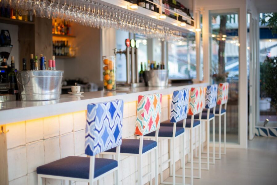
White tiles and a terracotta floor for La Bientirada
What sets the best beer houses apart from the rest, besides their good food and beers, is their ability to make us feel part…
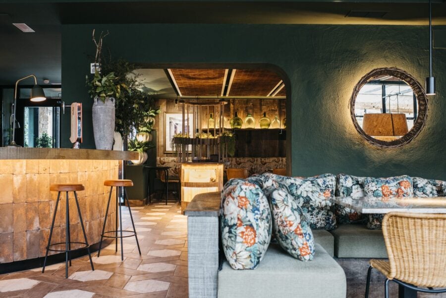
Rural style at Las Brasas del Mentidero
The success of a restaurant naturally resides in the quality of the dishes it serves. But while gastronomy may be a central parameter, it…
La Santita restaurant: terracotta wall tiles capture the essence of Mexico
La Santita restaurant sits on the emblematic Madrid street of Fuencarral. Inside, chefs prepare traditional Mexican food over a flame, the same element that…


